ABOUT
In late 2024, I was brought on to lead design for NSUTMUN 2025, NSUT's flagship Model United Nations conference. MUN branding on the circuit was templated and forgettable, and I wanted NSUTMUN to be the exception.
I built a unified identity from the ground up, spanning logo, placards, ID cards, signage, and socials, with the rigor of a professional brand.
The result? 650+ delegates from 6 states and the largest conference held in India.
MY ROLE
Design Lead
TIMELINE
Jan '25 - May '25
TOOLS
Figma
Illustrator
Photoshop
InDesign
Figjam


A conference by National University of Singapore students changed my perspective entirely. Their intentional typography and cohesive palette showed how design could elevate an event, and I began evaluating every MUN Conference's visual identity.
Enter: NSUTMUN '25
Boring templates aren't just an aesthetic problem, they're operational. Collegiate MUN conferences run on sponsorships and fees, and delegates deserve materials that reflect that value. Leading design for Netaji Subhas University of Technology Model UN '25, I built a high-impact system that treated it like a premium brand.


Kits from conferences I've attended as a delegate. Functional, but generic templates, inconsistent hierarchy and zero brand cohesion.
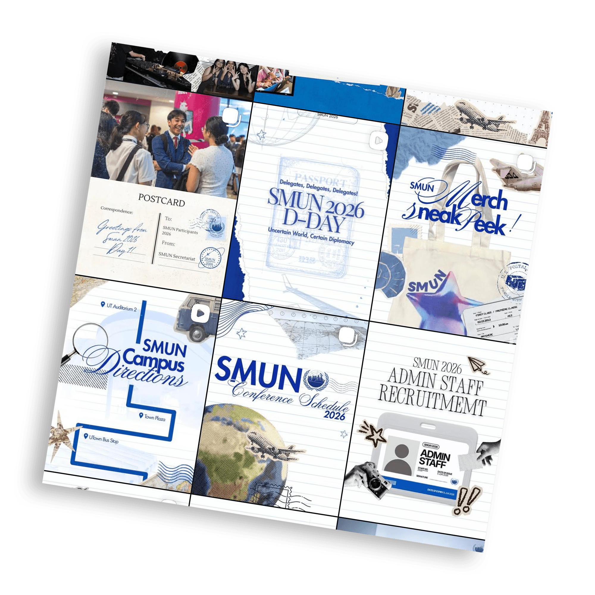
NUS's Singapore MUN campaign. This was the moment I realized MUN design could be treated as a real brand system, not an afterthought.
Because Model UN conferences require an immense volume of assets, from committee placards to country-specific stationery, organizers frequently take the easy way out and purchase generic templates. This neglects a massive artistic and commercial opportunity.
A collegiate conference is a serious financial undertaking. Delegates pay a premium registration fee for the experience, and the materials they take home should reflect that value. High-quality, intentional design changes the perception of the event, making it feel premium and justifying the ticket price. Ultimately, aesthetics set the price. By treating design as a strategic marketing asset rather than an administrative box to check, conferences can elevate the delegate experience and drive measurable growth in registrations.

Most conference placards come from mass-printed templates: generic flag grids with only the conference name swapped in. This ignores how each Model UN conference has its own theme and identity. Relying on rigid, automated designs erases that personality, turning a prestigious forum into a generic copy of every other conference.
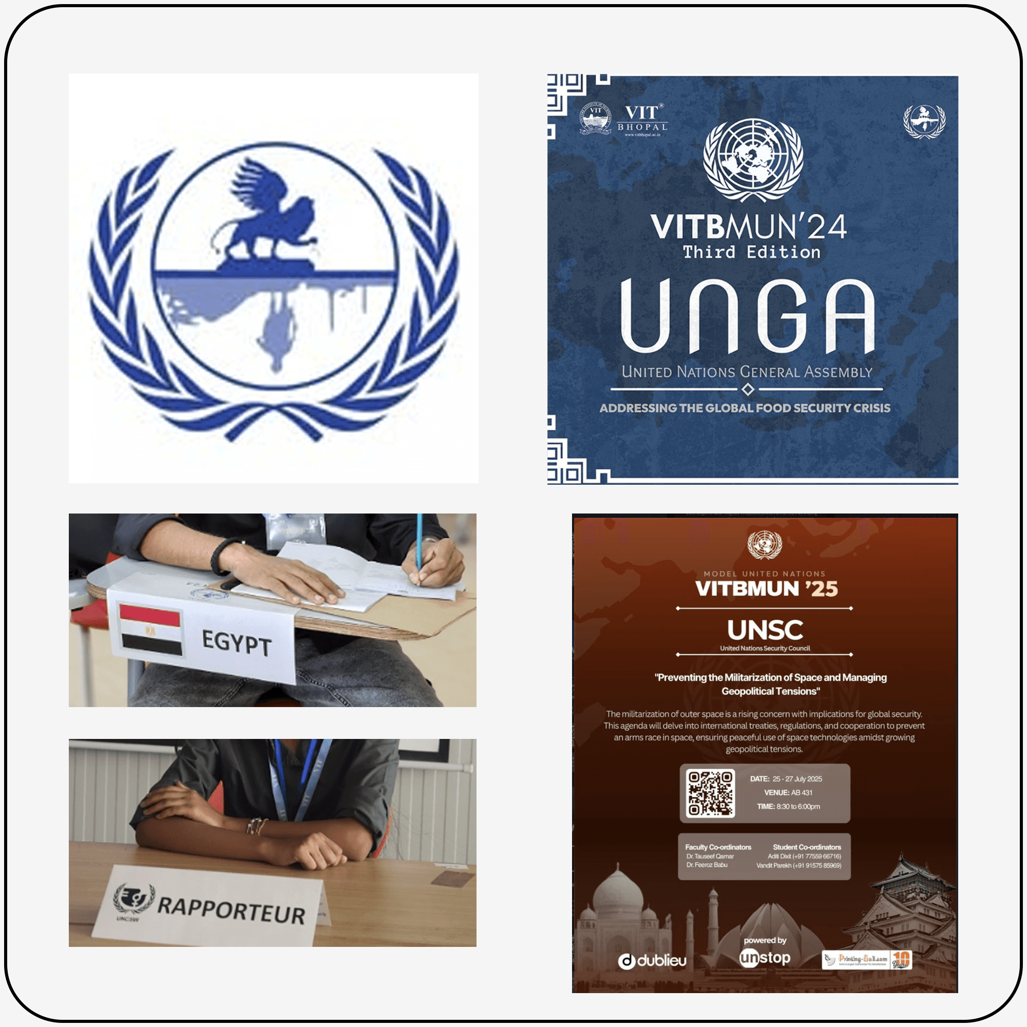

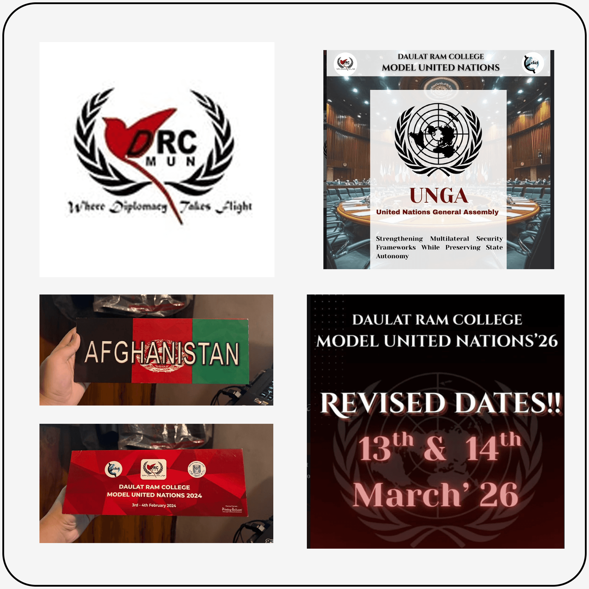
These are a few examples of MUN conferences across the circuit.
Either virtually indistinguishable from each other, or straight up mediocre on their own.
Deconstructing the Visual Homogeneity
The core problem is a fundamental failure in visual strategy, not a lack of resources. Most organizing committees treat design as a series of isolated tasks rather than a unified identity — handled ad hoc in-house, or outsourced to print shops running ready-made templates. Either way, the result is a complete lack of consistent or cascaded branding across touchpoints.
A social media post looks entirely disconnected from the physical ID card, which looks disconnected from the conference backdrop. Because teams design in silos without an overarching system, every event on the circuit ends up looking identical. Stripped of intentional hierarchy and visual cohesion, what remains isn't just uninspired, it is outright bad design that dilutes the event's overall presence.

Templatised delegate kits like this are sold off-the-shelf across the MUN circuit. Homogeneity isn't an accident here, it's a business model. And the underlying design isn't even good.
Spring 2025 was an absurdly busy time, but looking back, I was clearly on a personal crusade. To anyone else, managing design for DebSoc and NSUTMUN was just standard society grunt work: endlessly editing posters, resizing sponsor logos, and arguing over hex codes at 2 AM. But in my head, this wasn't just a college event; it was my chance to single-handedly wage war on hideous circuit graphics.
Armed with way too much coffee and an unearned amount of conviction, I treated a student conference like a high-stakes rebranding campaign, fully determined to save the Model UN world from another tragic default font.
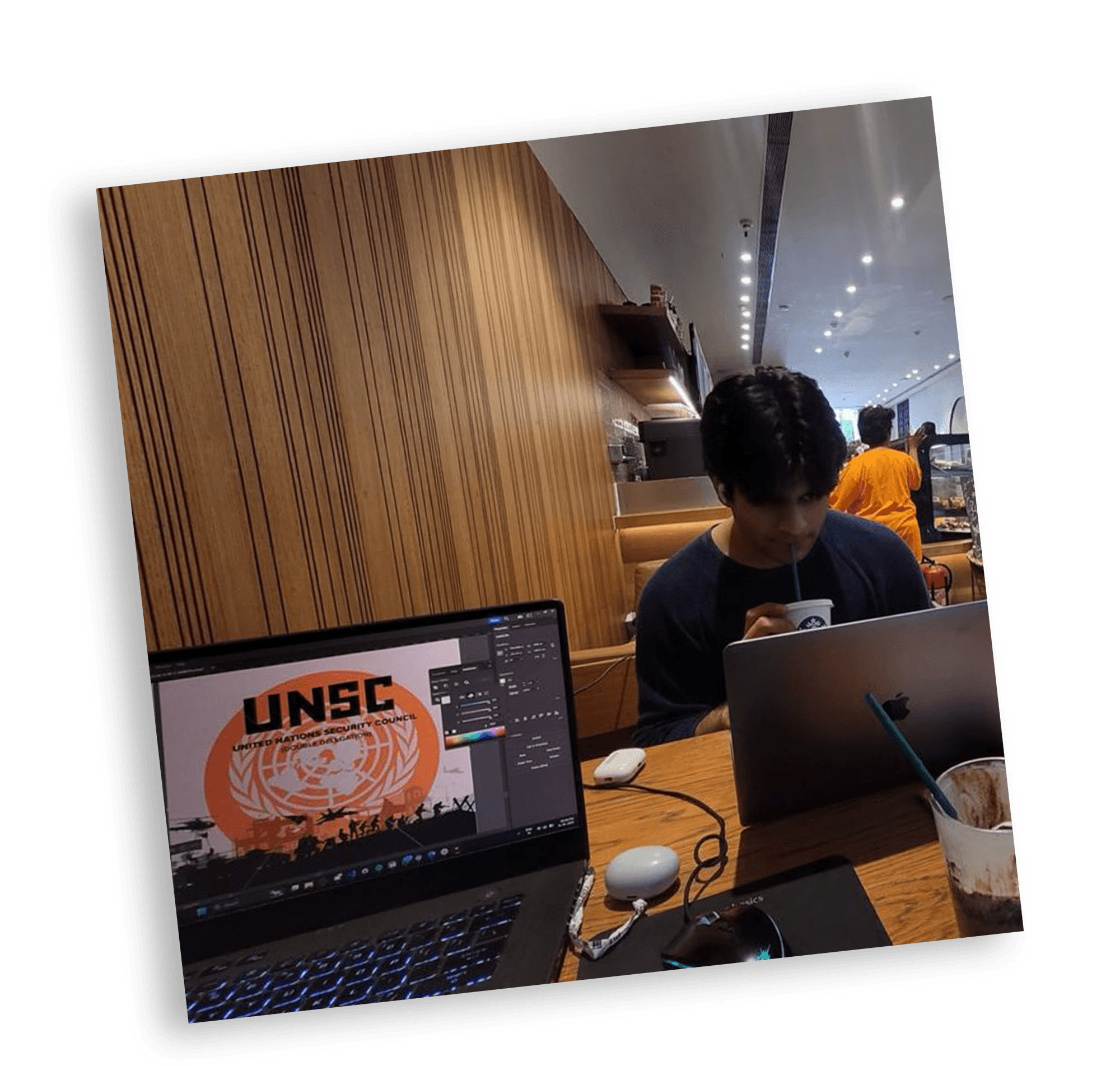

Three months. No breaks. Somehow I miss it.
With a fixed budget and no external studio to fall back on, every asset had to be conceived, produced, and finalized in-house, on a print timeline with no margin for a second attempt. Freshers weren't typically brought into design work at this level, but I pushed to change that, recruiting and training six juniors mid-project to build out a real design department within NSUTMUN. It meant building the system and the team executing it at the same time, but it also meant the society now had a pipeline of trained design talent that hadn't existed before.
The work also couldn't be treated as a closed process. Background guides required continuous coordination with executive board members drafting content, and physical assets demanded print schedules synced across other Organizing Committee verticals. Meeting the deadline meant managing those dependencies with the same rigor as the design system itself.
A timelapse of the work done over 4 months!
I took on NSUTMUN not as a routine society assignment, but as a genuine opportunity to disrupt the circuit's visual status quo. Rather than settle for the same recycled layouts that every other conference seemed to inherit, I saw a chance to question why placard design had been left unexamined for so long. The existing legacy needed a complete overhaul, and a new design standard had to take its place, one that treated identity as central rather than incidental.
To move away from cookie-cutter templates and actually build something the circuit hadn't seen before, the design strategy focused on three non-negotiable pillars: originality, adaptability, and a genuine sense of conference identity woven into every printed piece.
Unified Identity Across Touchpoints
Cascading a single visual language across every asset, ensuring social media, ID cards, physical placards, and stage backdrops feel like one cohesive ecosystem.
Distinctive Visual Signatures
Moving away from generic stock grids to create custom, bespoke graphics that capture the specific theme and ethos of the conference.
Industry-Grade Execution
Applying professional-level typography, color theory, and layout hierarchy to elevate a student-led event into a premium brand experience.
These three pillars became my north star. With a clear design direction in place, I moved from strategy into execution, sketching, and building out the system piece by piece until it took the shape you'll see next.


Building a cohesive visual identity across all digital platforms. From announcement carousels to speaker spotlights, every post was crafted with a deliberate grid system and uniform typography to establish a professional, recognizable brand presence online before delegates even arrived.


Transforming dense committee backgrounders and conference itineraries into scannable, visually structured layouts. The focus was on clear hierarchy, functional color-coding, and clean typography to make complex geopolitical briefs easily readable during intense debate.


Translating the digital brand into tangible collateral across campus. This included bespoke delegate ID badges, event posters, custom country placards, and branded notepad pads—ensuring every physical item felt like a premium keepsake rather than generic stationery.


These design systems were printed, distributed, and put to the test in real time. Seeing hundreds of delegates engage with a fully unified brand identity proved that treating a student conference like a serious design endeavor completely elevates the entire experience.
Some data gathered from NSUTMUN 2025:
38% growth in viewership compared to the 2023 edition
650+ delegates, outperforming the industry benchmark of 350 average delegates per conference by 85%
Representation from 6 states, a level of national reach only a handful of conferences achieve
3 sponsors secured, contributing ₹80,000 in total funding
From Student to Benchmark
The story came full circle soon after. Singapore Model UN was the exact conference whose design standards inspired me to rethink our own visual identity in the first place. After NSUTMUN wrapped up, I had the opportunity to travel to Singapore and attend SMUN. While chatting with their design head, I found out something surreal: when working on their latest delegate ID cards, they had been using our NSUTMUN designs as their primary reference. What started as me trying to emulate world-class work ended up becoming the new benchmark for the very circuit that inspired me.
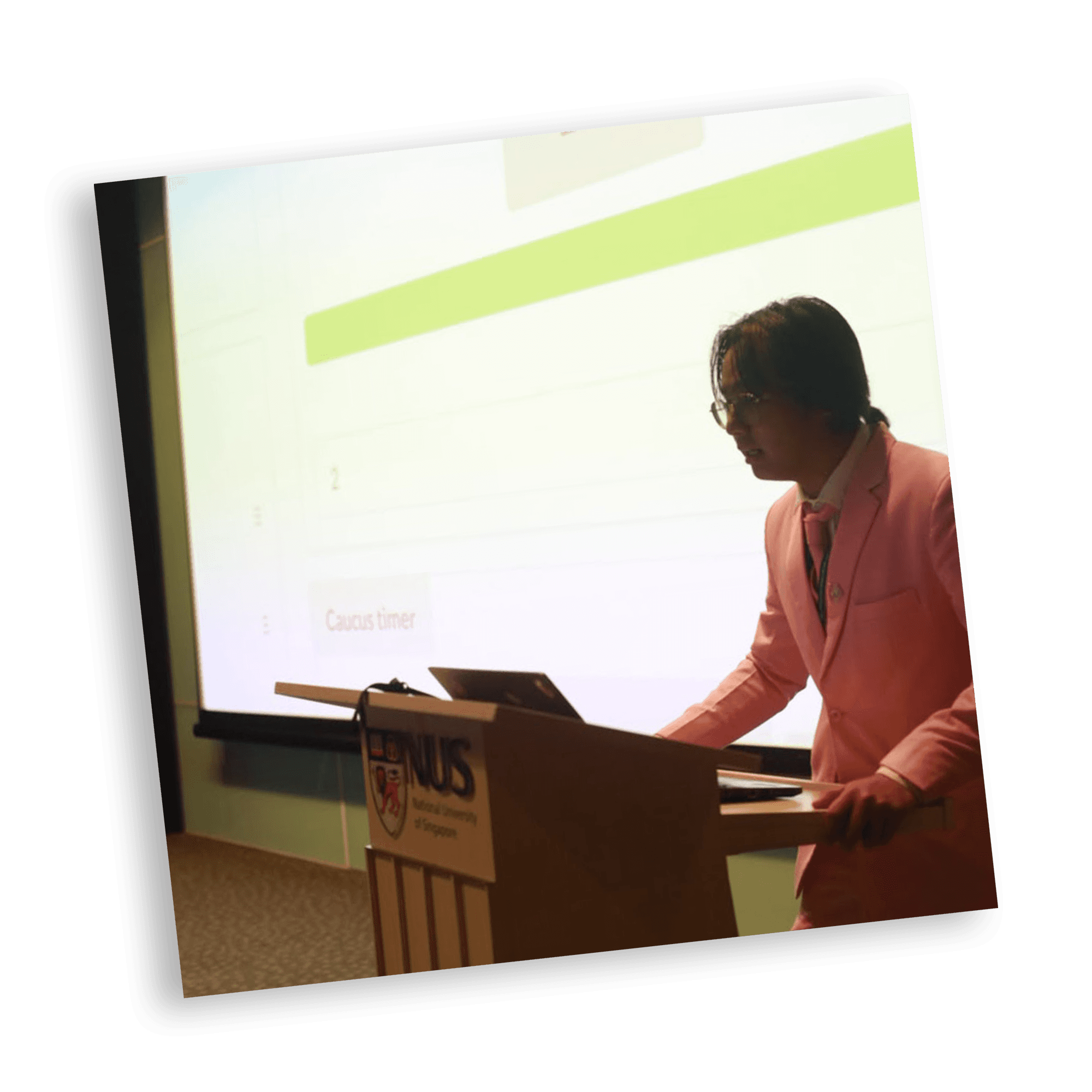

Debating at NUS!
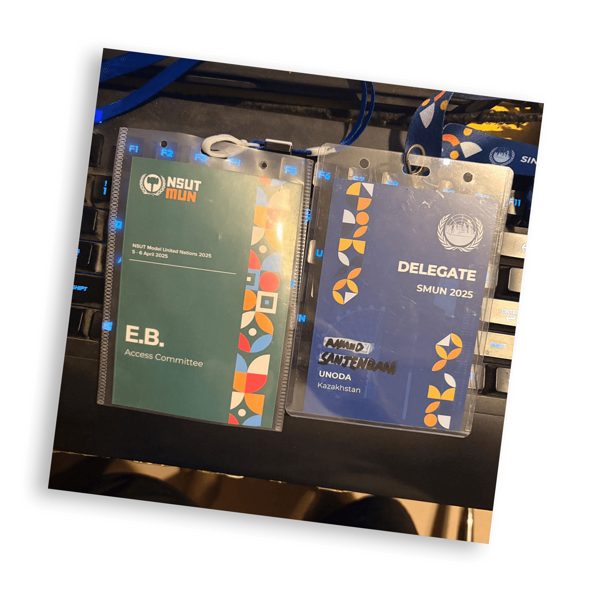
I was so surprised when I got this ID card. Turns out their design team had used my Behance uploads of NSUTMUN as reference for this year's SMUN.